My Campus and Bird Count Analyses
I participated in the Campus Bird Count(Campus Bird Count 2025 - Bird Count India), held in a university campus in 2023 by Green Army
Then was part of conducting it in 2024 and 2025 with Green Army.
2025 was the 11th consecutive year that the CBC was being held in my college campus, so I thought I'd do some data exploration with the eBird API. So, I dove right in.
Here, I'll tell you HOW to prepare the data for your own Hotspot or if you just wanna go to the results, just skip the code part!
THE CODE PART
Step 1:
Get all eBird Observations for your hotspot ID from the eBird website using your eBird API Token.
import requests
import pandas as pd

# Define the API URL pattern

base_url = "[https://api.ebird.org/v2/data/obs/$HOTSPOTID/historic/{year}/{month}/{day}](https://api.ebird.org/v2/data/obs/$HOTSPOTID/historic/%7Byear%7D/%7Bmonth%7D/%7Bday%7D)"
filepath = "ebird_data.xlsx"

# Define the date ranges

date_ranges = {
2015: ("02", ["13", "14", "15", "16"]),
2016: ("02", ["12", "13", "14", "15"]),
2017: ("02", ["17", "18", "19", "20"]),
2018: ("02", ["16", "17", "18", "19"]),
2019: ("02", ["15", "16", "17", "18"]),
2020: ("02", ["14", "15", "16", "17"]),
2021: ("02", ["12", "13", "14", "15"]),
2022: ("02", ["18", "19", "20", "21"]),
2023: ("02", ["17", "18", "19", "20"]),
2024: ("02", ["16", "17", "18", "19"]),
2025: ("02", ["14", "15", "16", "17"]),
}

# API headers

headers = {
'x-ebirdapitoken': '$TOKEN'
}
Step 2:
Store all of the data in a nice Excel Sheet, now why did I do this? Because it's nice to have your data stored separately in case you want to go in the middle and perform any manual operations. Which I have.
# List to store all data
all_data = []

# Iterate through each year and date range
for year, (month, days) in date_ranges.items():
    for day in days:
        url = base_url.format(year=year, month=month, day=day)
        response = requests.get(url, headers=headers)

        if response.status_code == 200:
            data = response.json()
            if data:  # Ensure data is not empty
                for entry in data:
                    entry['year'] = year  # Add year for reference
                    entry['date'] = f"{year}-{month}-{day}"  # Add full date
                    all_data.append(entry)

# Convert the list of data into a DataFrame
df = pd.DataFrame(all_data)

# Save the data to an Excel file
df.to_excel(filepath, index=False)

print("Excel file 'ebird_data.xlsx' has been created successfully.")
Step 3:
Get the data from your Excel Sheet and put it into a heatmap. It should input something like the below.
import pandas as pd
import matplotlib.pyplot as plt
import seaborn as sns
import numpy as np
import matplotlib.font_manager as fm

# Load the Excel sheet
df = pd.read_excel(filepath)

# Extract necessary columns
df["year"] = pd.to_datetime(df["date"]).dt.year  # Extract year from date
df["obsDt"] = pd.to_datetime(df["obsDt"])  # Convert obsDt to datetime

# Count unique species per year
species_per_year = df.groupby("year")["comName"].nunique()

# Count unique checklists per year
checklists_per_year = df.groupby("year")["obsDt"].nunique()

# Display summary
print("Species per year:\n", species_per_year)
print("\nChecklists per year:\n", checklists_per_year)

# Prepare data for heatmap (species x year)
heatmap_data = df.pivot_table(index="comName", columns="year", values="howMany", aggfunc="sum", fill_value=0)

# Normalize values within each species to range [0,1], keeping 0 as gray
normalized_data = heatmap_data.copy()
for species in normalized_data.index:
    max_count = normalized_data.loc[species].max()
    if max_count > 0:
        normalized_data.loc[species] = normalized_data.loc[species] / max_count

# Set dark mode style
plt.style.use("dark_background")

# Load custom font
# font_path = "CrimsonText-Regular.ttf"  # Use available font
# custom_font = fm.FontProperties(fname=font_path)

# Define colormap: gray for 0, a brighter green for presence
cmap = sns.color_palette([(0.3, 0.3, 0.3)] + sns.light_palette("limegreen", as_cmap=True)(np.linspace(0, 1, 256)).tolist())

# Prepare annotations without displaying zero values
annotations = heatmap_data.applymap(lambda x: f"{x:.0f}" if x > 0 else "")

# Create heatmap
plt.figure(figsize=(12, 25))
sns.heatmap(
    normalized_data,
    cmap=cmap,
    linewidths=0.2,
    linecolor="black",
    cbar=True,
    annot=annotations,  # Show actual counts if greater than 0
    fmt="",
    annot_kws={"size": 8, "color": "black"}  # Adjust annotation text
)

# Customize the plot
plt.xlabel(r"Year    Source: www.ebird.org", fontsize=14, color="white")
plt.ylabel("Species", fontsize=14, color="white")
plt.title("CHRIST University CBC Species Over the Years", fontsize=16, color="white")

# Save the heatmap
heatmap_image_path = "bird_sightings_heatmap.png"
plt.savefig(heatmap_image_path, bbox_inches="tight", dpi=300, facecolor="black")

# Show plot
plt.show()

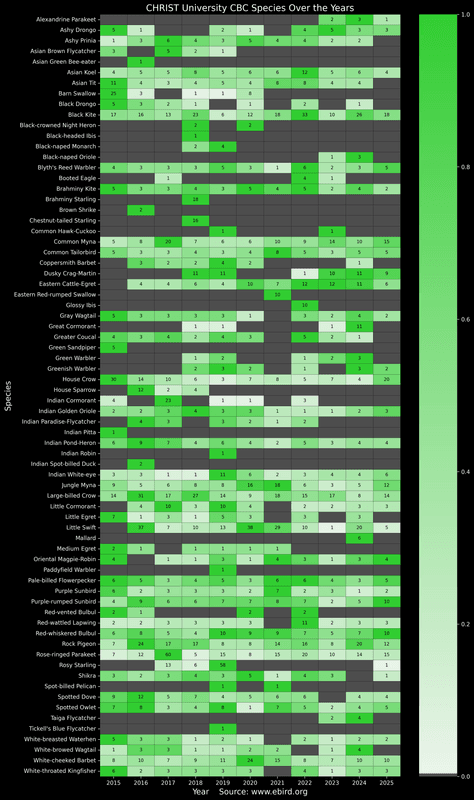
Pretty cool. It has all the species on the left, all the years on the bottom. And shaded with a heatmap and each occurence is marked in the box. It's grey if it hasn't been seen. But I wanted something a bit more interpretive. Which led me back into the Excel file, where I just tweaked the order and made the following.
THE RESULT AND INTERPRETATION

Ahh, this is much better. What's the rule I have used to sort this?
1- SORT ASC ALL BY Last seen year 2- FOR EVERY LAST SEEN YEAR GROUP, SORT ASC No. Of years seen
What can I interpret from this? A bunch pretty clearly.
a) Indian Pitta and the Green Sandpiper, only seen in the first CBC. b)2025 is the ONLY YEAR that Asian Tit and Ashy Prinia haven't been seen. c)Rosy Starling has been seen in 2025 CBC, having last been seen in 2019.
I did want to compare the efforts of every year, so I made some graphs straight from the Excel file.


The trend does not seem promising. I have seen and heard, every sign of the underbrush being removed, every year, slowly removing the habitats for Tits, Prinias, and Pittas, and this being done in favour, of a more "manicured" "presentable" idea of a "Green" Campus. This is one kind of reflection of the education that is being disseminated to the students.
Somewhere along the line, the idea of a "Birds' Park" involves store-bought birds being kept in cages and not a habitat that is actually welcoming for birds.
And the students walking past it every day think they are looking into a cage, but few realize they are also looking at a mirror.


(PS: The "Birds Of America" is a set of WONDERFUL illustrations of birds that are now in the public domain, and preserved beautifully in 4k)(Thats where the bird background art in the slides is from. Thanks James Gould!)
Acknowledgements: Bhuvan Raj K, Samarth Kedilaya, Bhaveesh Shetty, Vikas D Prasad for being the resource persons on the ground!